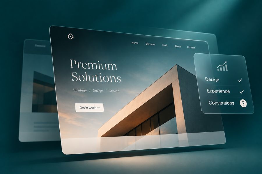
Your website looks impressive. The typography is elegant, the animations are smooth, and every section feels carefully designed.
Your competitors probably wish their websites looked as good.
But here’s a question worth asking: is that beautiful website actually helping your business grow?
For companies selling high-value services or products, premium website conversion depends on much more than visual presentation.
Your visitors need to understand your offering, trust your expertise, and feel confident taking the next step.
If they leave impressed by the design but confused about what your business actually delivers, something important has gone wrong.
And no amount of visual polish can compensate for that.
A Premium Website Needs to Justify the Investment
When someone considers purchasing an expensive service, they’re evaluating risk.
They want to know whether your company understands their problem, has relevant experience, and can deliver what it promises.
Your website often provides the first opportunity to answer those questions.
Design plays an important role in establishing credibility. A consistent visual identity, thoughtful layout, and professional presentation can reinforce the quality of your brand.
But appearance creates expectations.
If your website looks sophisticated while its content remains generic, the experience becomes inconsistent.
A premium service deserves a website that communicates its value with the same level of care invested in its appearance.
That requires strategy, clear messaging, and an understanding of how potential customers make decisions.
1. Your Homepage Looks Great but Explains Very Little
One of the most common problems with visually ambitious websites is an overreliance on abstract messaging.
Large headlines make bold promises. Beautiful videos fill the background. Carefully animated elements attract attention.
But visitors still struggle to understand what the company actually does.
A homepage should quickly communicate your offering, your audience, and why your business deserves consideration.
You don’t need to explain every service in the first section.
You do need to give people enough information to decide whether they’re in the right place.
For example, a specialised consulting firm should make its expertise and target audience clear.
A technology provider should explain which business problems its solutions address.
Creative language can support your positioning, but clarity should come first.
Our approach to website design and development starts with understanding what a business needs to communicate before deciding how it should look.
2. Beautiful Animations Are Creating a Worse Experience
Motion can make a website feel engaging.
Subtle transitions, responsive interactions, and well-executed animations can guide attention and improve the overall experience.
But excessive animation can quickly become a problem.
Visitors shouldn’t have to wait for content to appear, struggle with unusual scrolling behaviour, or navigate around decorative elements to find essential information.
This matters particularly on mobile devices, where screen space and performance constraints are different.
Google’s Core Web Vitals provide useful signals for assessing aspects of real-world user experience, including loading performance, responsiveness, and visual stability.
These measurements don’t determine whether your website is commercially effective, but they can reveal technical problems worth investigating.
A premium experience should feel reliable and effortless.
If an animation interferes with reading, navigation, or completing an enquiry, its visual appeal isn’t enough to justify keeping it.
3. Your Service Pages Don’t Help Buyers Make Decisions
High-ticket buyers rarely make decisions based on a homepage alone.
They explore service pages, compare providers, examine previous work, and look for information that helps them assess the investment.
Your service pages need to support that research.
Explain what the service includes, who it’s designed for, how the process works, and what the customer should expect.
Avoid filling entire sections with generic claims about quality and innovation.
Where possible, support your explanations with credible examples.
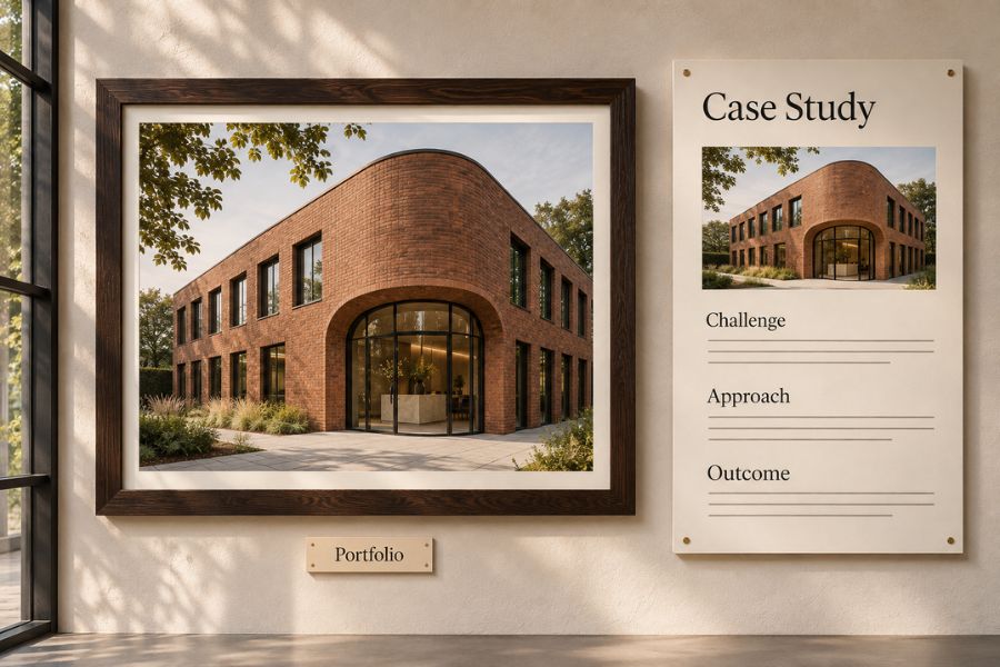
A relevant case study can communicate more than several paragraphs of promotional language.
Our iOwn project demonstrates how website development and organic visibility can be considered together within a wider digital strategy.
For prospective customers, examples of completed work help make an agency’s capabilities easier to evaluate.
That evidence should be accessible from the services it supports.
4. Your Mobile Website Feels Like an Afterthought
A desktop design might look exceptional on a large monitor.
That doesn’t guarantee the same experience on a phone.
Headlines may become difficult to read. Important buttons might appear too far down the page. Complex layouts can become confusing when compressed into a narrow screen.
And a contact form that works perfectly on desktop may be unnecessarily frustrating on mobile.
Responsive design should involve more than rearranging columns.
It requires examining the entire user journey on different devices.
Can visitors understand your offering without excessive scrolling?
Is the navigation straightforward?
Are forms comfortable to complete?
Does the website load and respond reliably?
Testing these questions on real devices can reveal problems that aren’t immediately obvious inside a design editor.
5. Your Calls to Action Don’t Support the Buying Journey
Many websites repeat the same contact button across every section without considering what visitors need at that moment.
Someone reading an educational article might want to explore a relevant service.
Someone reviewing a case study may be ready to discuss a similar project.
A visitor on a service page might need reassurance about the process before making an enquiry.
These situations call for different types of guidance.
A useful call to action should feel like the natural next step.
It should also set reasonable expectations.
Explain what happens after someone contacts your business, whether that’s an introductory discussion, a project assessment, or a proposal process.
For expensive services, reducing uncertainty can make the decision to reach out easier.
What Isn’t Worth Spending Money On
A complete redesign isn’t always the answer to disappointing website performance.
Neither is adding more animations, purchasing expensive visual assets, or copying the latest design trends.
If your messaging is unclear, your services are poorly explained, or your enquiry process is unreliable, cosmetic changes may have limited commercial value.
Before investing in another redesign, identify the actual problems.
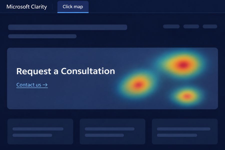
Use analytics to understand which pages attract relevant visitors.
Examine user behaviour, test your forms, and speak with the team handling incoming enquiries.
Sometimes improving a few important pages makes more sense than rebuilding everything.
And when a complete redesign is justified, those findings should guide the project from the beginning.
How to Measure Premium Website Performance
A useful evaluation combines technical, behavioural, and commercial information.
Review loading performance and usability alongside important conversion events.
Examine how visitors interact with your service pages, whether enquiries reach your team, and how many become qualified opportunities.
You should also consider the role of organic visibility.
A website that converts well but cannot attract relevant visitors still has an acquisition problem.
That’s why SEO & GEO should be considered during website planning, rather than added as an afterthought.
However, avoid treating a single conversion rate as the complete measure of success.
High-ticket customers often research extensively before making contact.
The objective is to create a website that supports that process and generates meaningful business opportunities over time.
FAQ
What makes a premium website convert?
Clear messaging, credible evidence, intuitive navigation, strong performance, and relevant calls to action all contribute to a better conversion experience.
Does expensive website design guarantee better conversions?
No. Design quality matters, but commercial performance also depends on audience relevance, content, usability, trust, and the overall customer journey.
How can I improve my website conversion rate?
Start by reviewing your most important pages, testing forms, checking mobile usability, examining visitor behaviour, and identifying where qualified prospects encounter friction.
Should I redesign my website or optimise the existing one?
That depends on the problems identified. Targeted improvements may be sufficient, while broader structural, technical, or positioning issues can justify a complete redesign.
Let’s Build a Website That Performs as Well as It Looks
If your website reflects the quality of your brand but isn’t generating the business opportunities you expect, we’d be happy to explore why. Let’s talk about your current website, your customers, and what a stronger digital experience could deliver.